Why the Dial Deserves a Closer Look
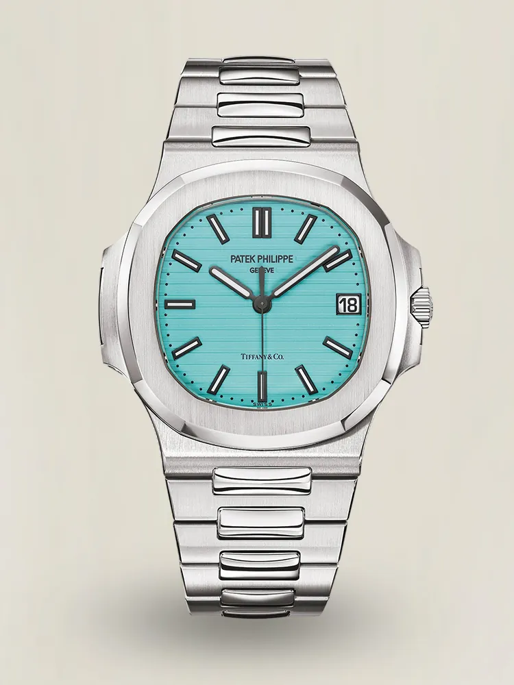
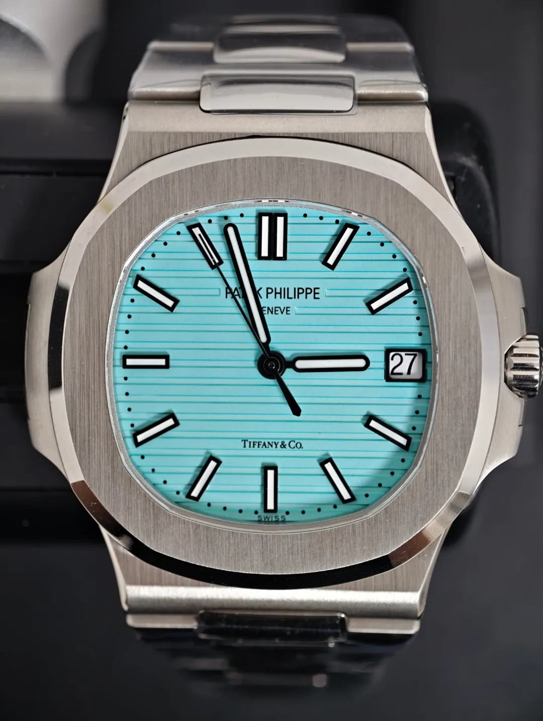
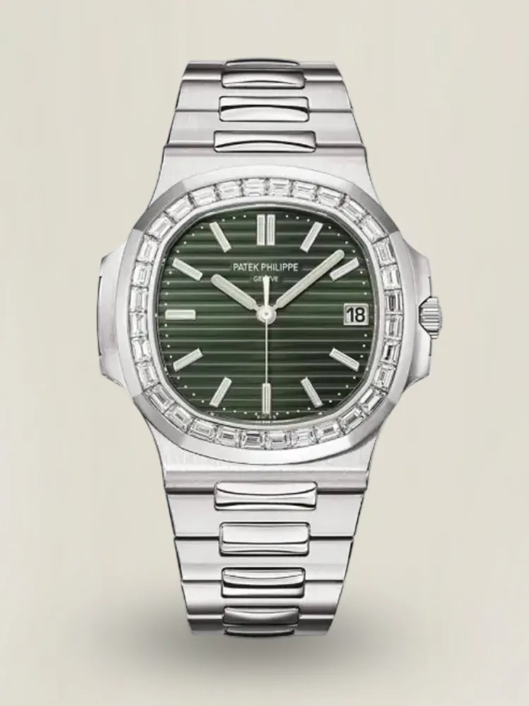
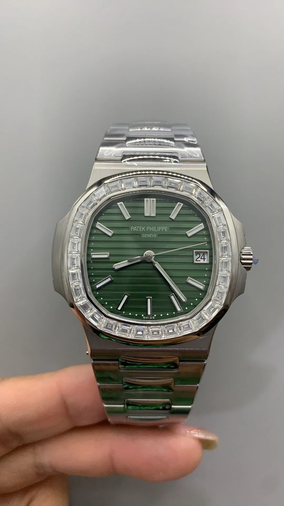
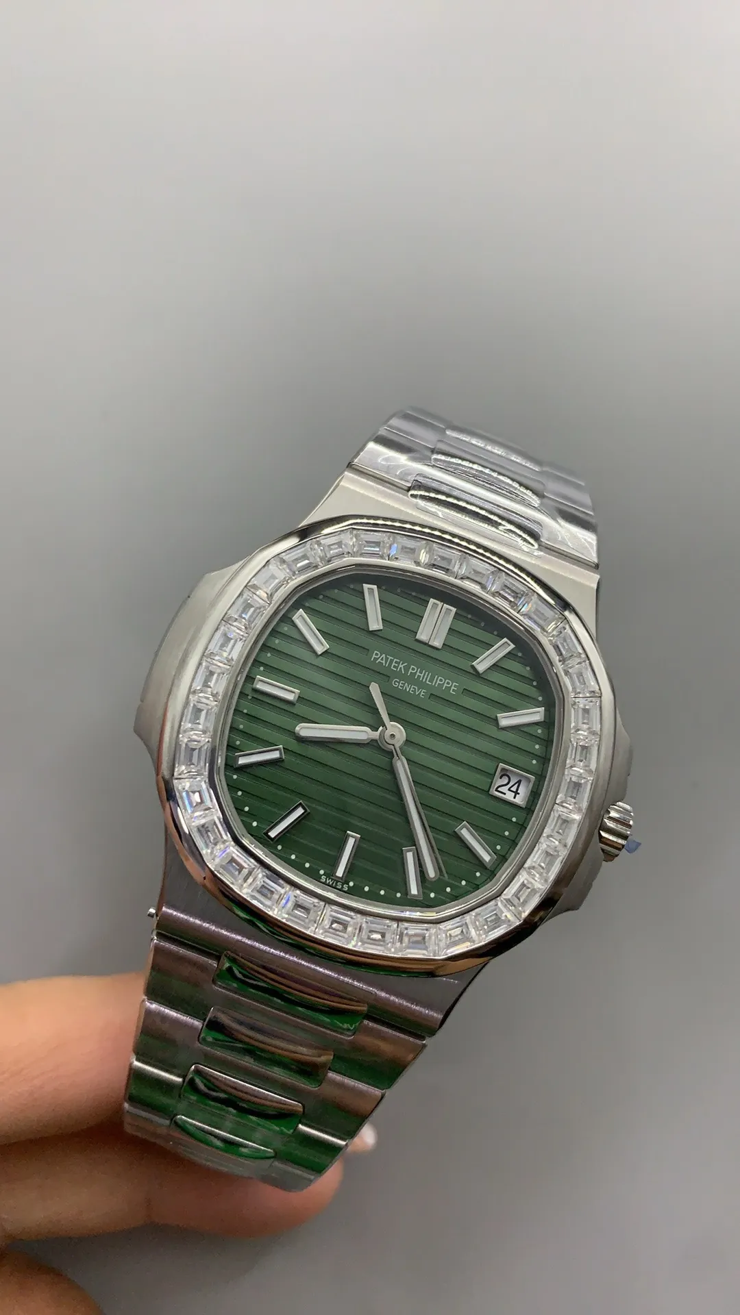
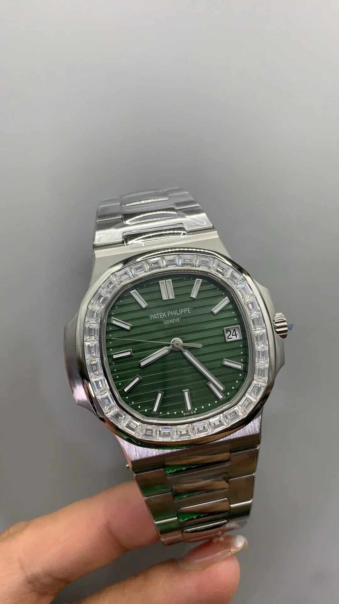
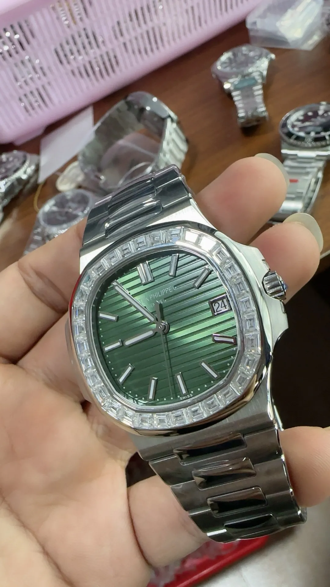
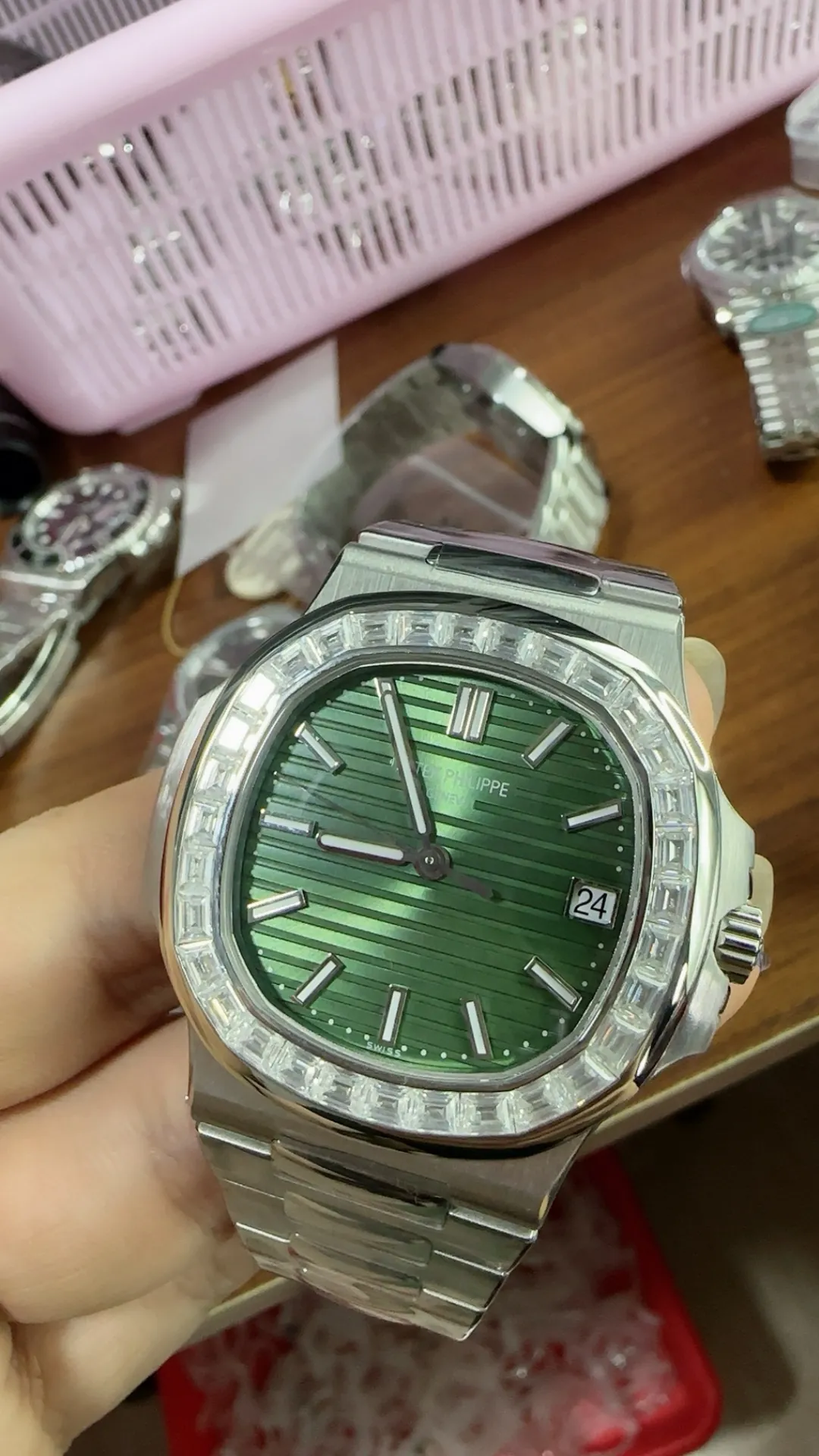
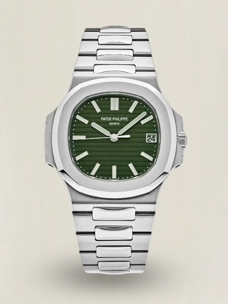
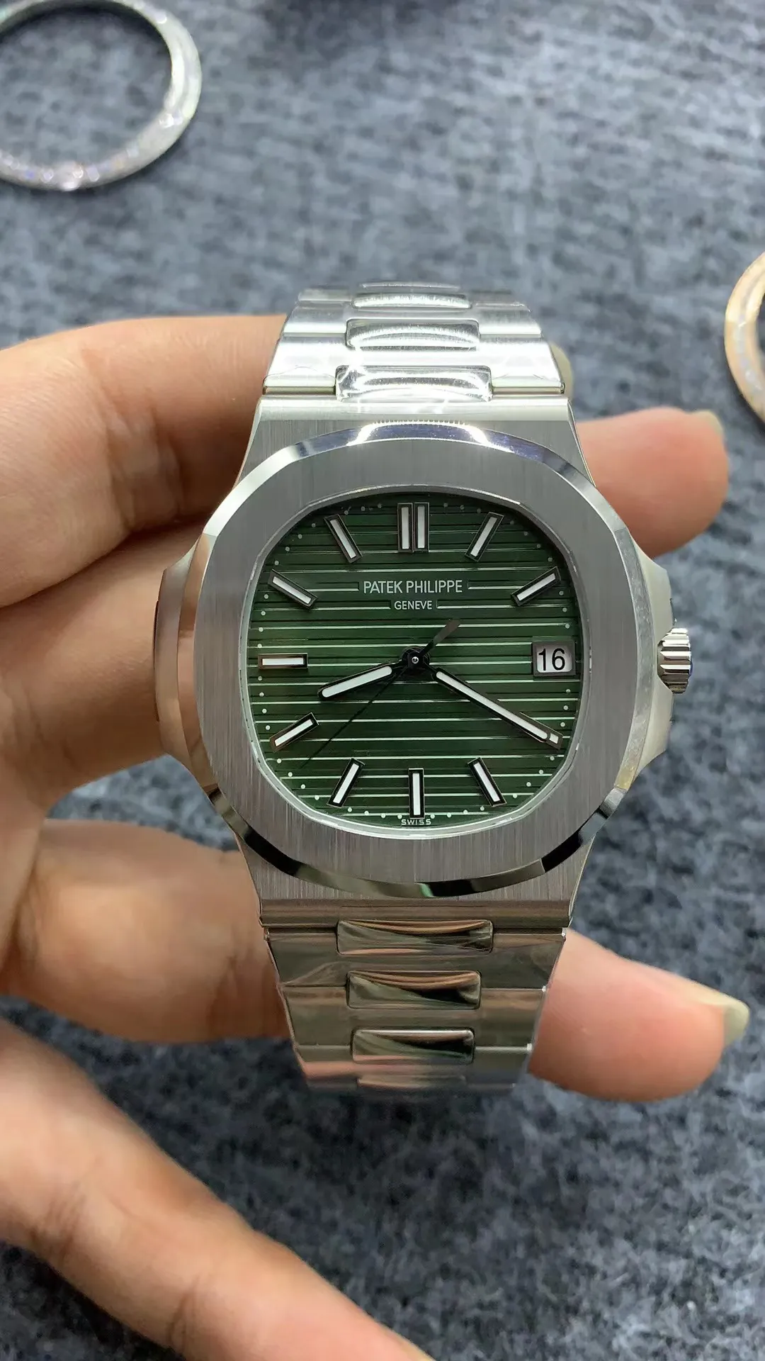
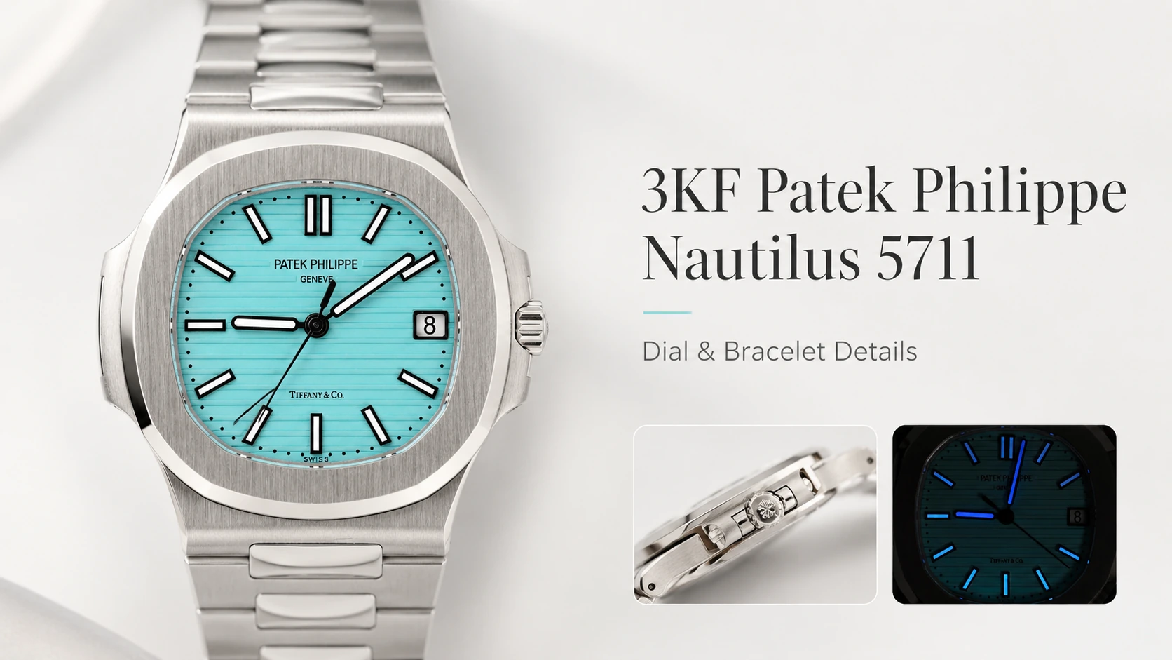
The 3KF Patek Philippe Nautilus 5711 immediately draws attention through its dial, because this is the part of the watch that defines the first visual impression. The Nautilus design is simple at first glance, but the blue dial contains more detail than it seems. Horizontal grooves stretch evenly across the surface, while the darker outer edge gives the dial a noticeable sense of depth. Under indoor lighting, the blue can appear restrained and slightly darker. In stronger natural light, the center becomes brighter and the gradient is easier to notice. This change in appearance is important because a Nautilus dial should not look flat under every lighting condition. On the 3KF version, the color shift adds character without making the dial look overly bright or artificial during normal wrist wear.
Blue Tone Changes With the Light
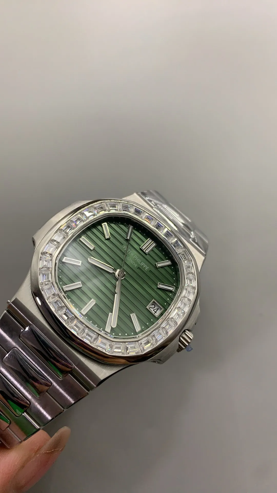
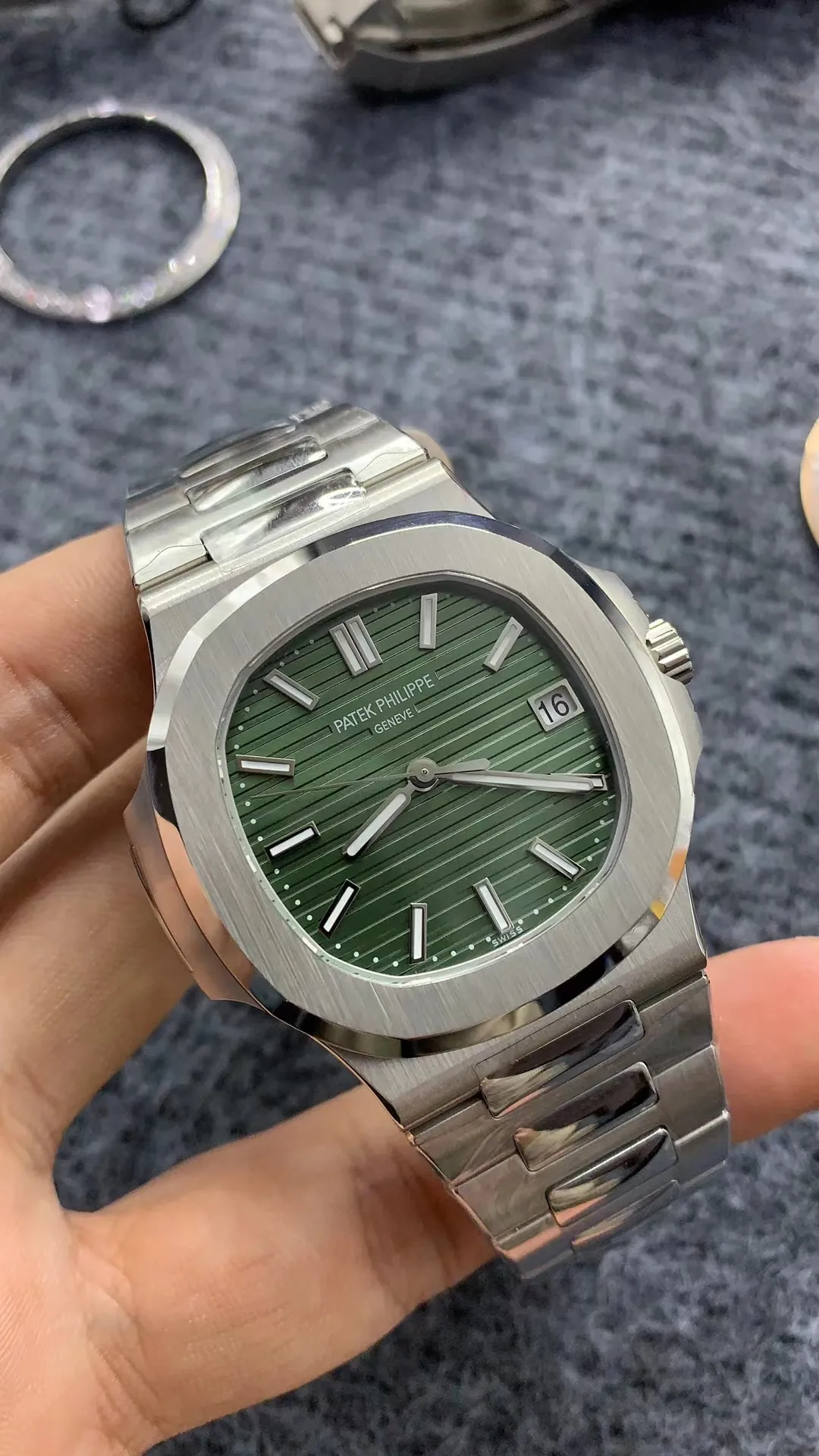
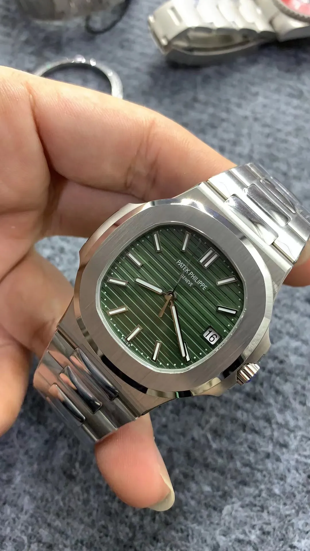
One of the most interesting parts of the 3KF Patek Philippe Nautilus 5711 is how the dial reacts when the viewing angle changes. Looking directly at the watch, the blue can seem deep and relatively calm, especially indoors. Move the wrist toward a window or a brighter light source, and the center of the dial starts to show a clearer blue tone. The darker edge remains visible and helps create a gradual transition instead of a single flat color. This effect matters more than simply asking whether the dial is “blue enough.” A convincing Nautilus-style dial needs contrast between the center, the edge, and the horizontal texture. On this version, the visual effect is strongest in natural daylight, where the grooves and gradient become easier to see without making the dial look excessively reflective.
Horizontal Grooves Add More Than Texture
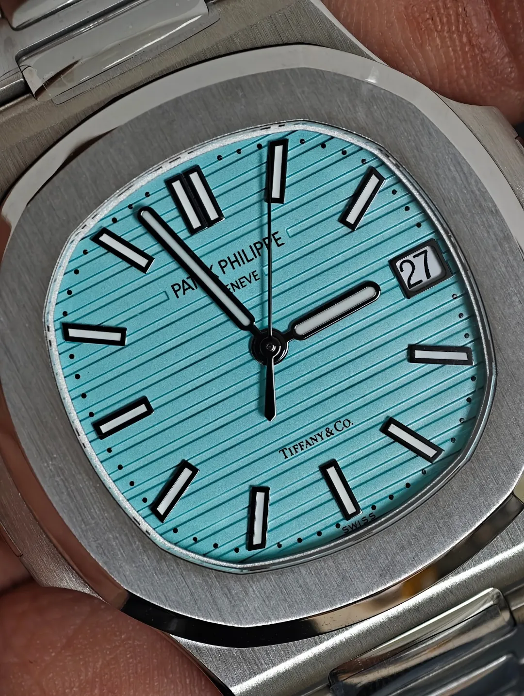
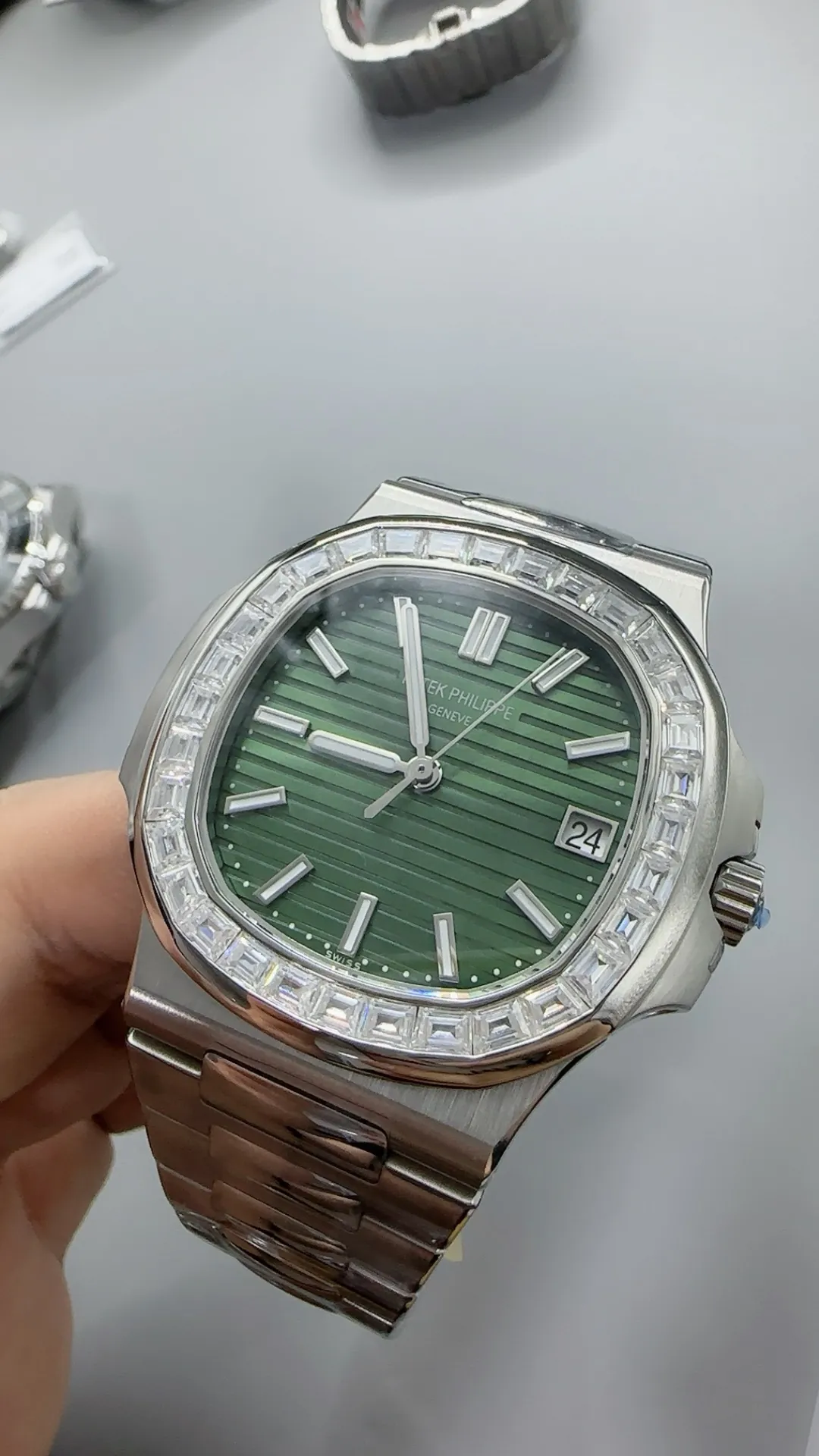
The horizontal pattern is one of the details that gives the Nautilus dial its recognizable character. On the 3KF version, the grooves run consistently across the surface and remain visible without becoming too dominant. From normal wrist distance, they create a subtle texture rather than making the dial look heavily engraved. When viewed closely, the spacing between the lines becomes easier to judge, and this is where the quality of the dial construction becomes more obvious. The grooves also interact with light differently depending on the angle of the watch, which helps prevent the surface from looking plain. A well-made horizontal pattern should support the dial color rather than compete with it. Here, the texture works together with the blue gradient and polished markers, giving the face more depth while keeping the clean appearance associated with the 5711 design.
Markers, Hands, and Dial Balance
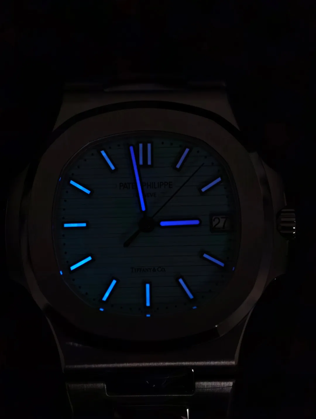
The hour markers and hands play a major role in keeping the dial visually balanced. On the 3KF Patek Philippe Nautilus 5711, the applied markers have a polished surface that catches light clearly against the darker background. The double marker at twelve o’clock is especially important because even a small alignment issue would be easy to notice. The remaining markers sit cleanly around the dial and maintain a consistent shape. The hour and minute hands follow the same simple baton-style design, with polished edges and luminous material placed through the center. Their proportions suit the wide dial and do not make the display feel crowded. From normal viewing distance, the combination of markers, hands, and horizontal grooves looks clean and organized. Macro photographs may reveal tiny finishing details, but during regular wear, the overall presentation remains sharp and well balanced.
Date Window Is a Small but Important Detail
The date display at three o’clock may occupy only a small part of the dial, but it has a strong effect on the overall appearance. On a simple watch like the Nautilus 5711, there are very few elements to distract the eye, which means the position, font, and alignment of the date become easier to notice. The 3KF version keeps the window neatly integrated into the horizontal dial layout. The white date background creates a clear contrast against the blue surface, while the black numerals remain easy to read. The spacing around the window is also important because an oversized opening could disturb the balance of the dial. When checking this area closely, the most useful details to observe are whether the number sits vertically centered, whether the font looks consistent, and whether the window edges appear clean under magnification.
Bracelet Finishing Creates the Nautilus Look
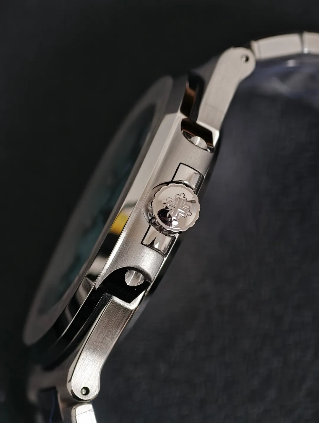
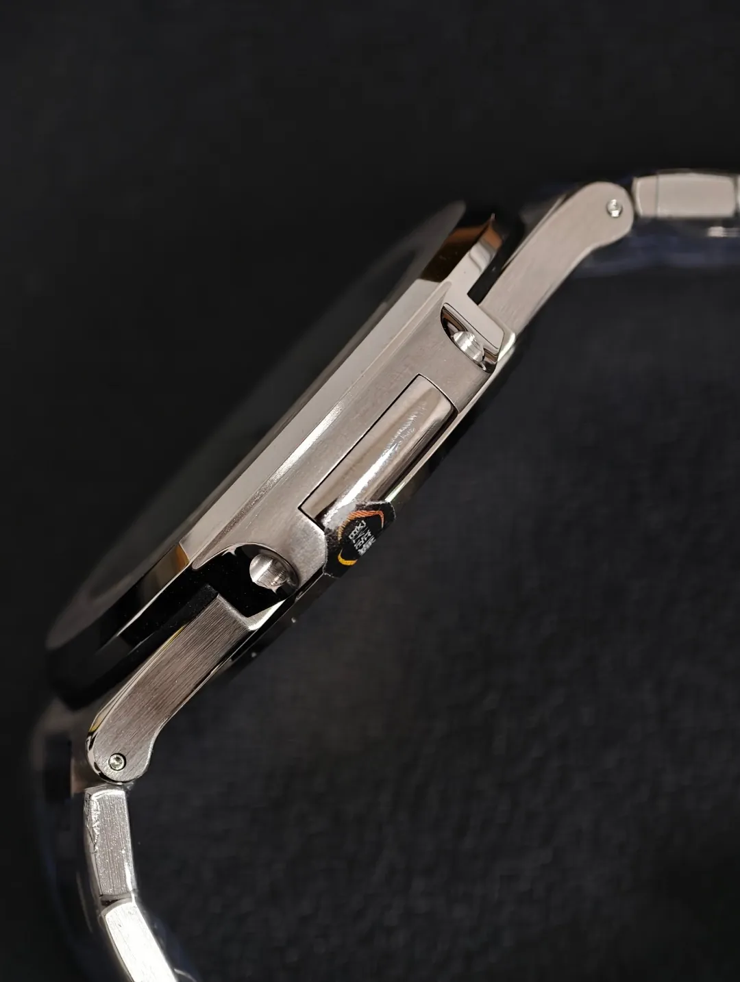
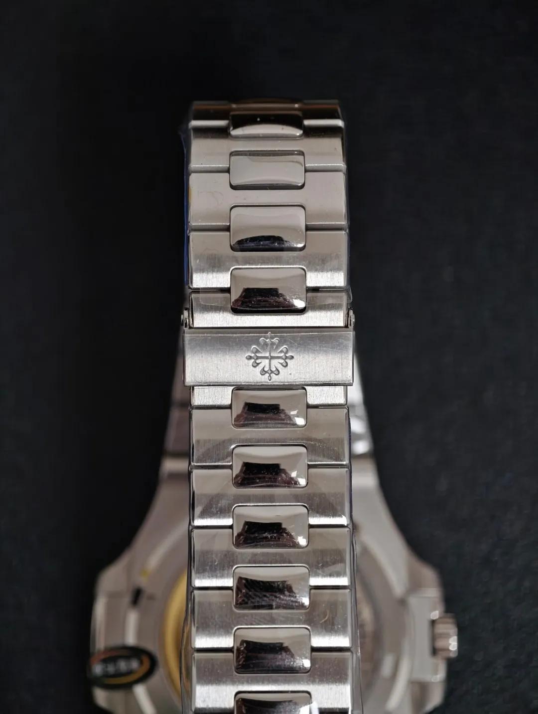
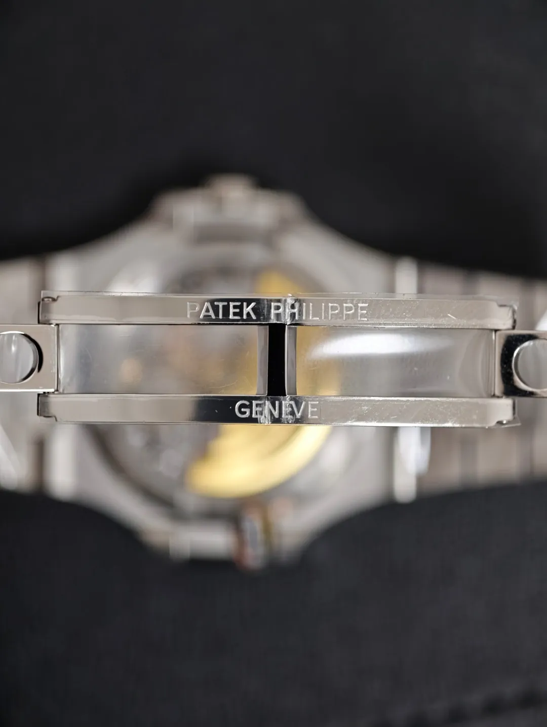
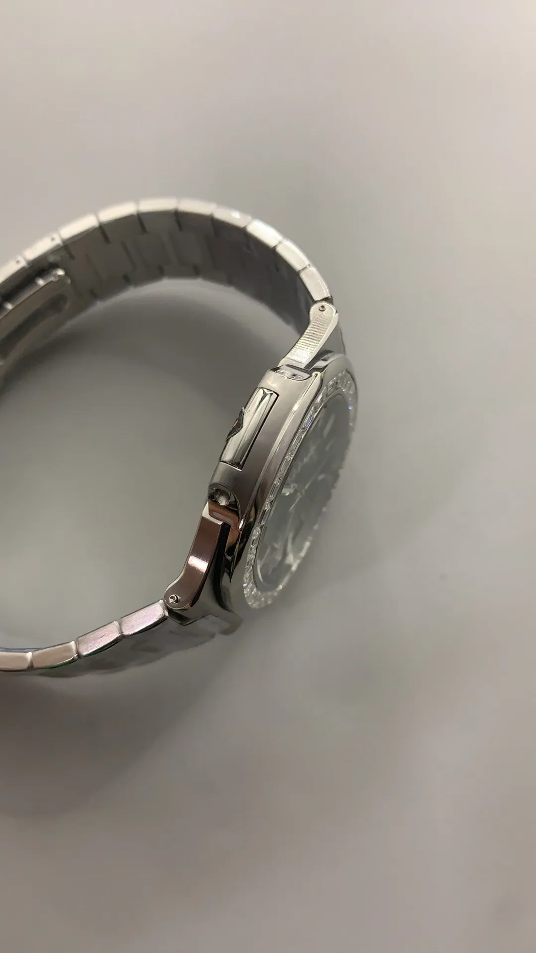
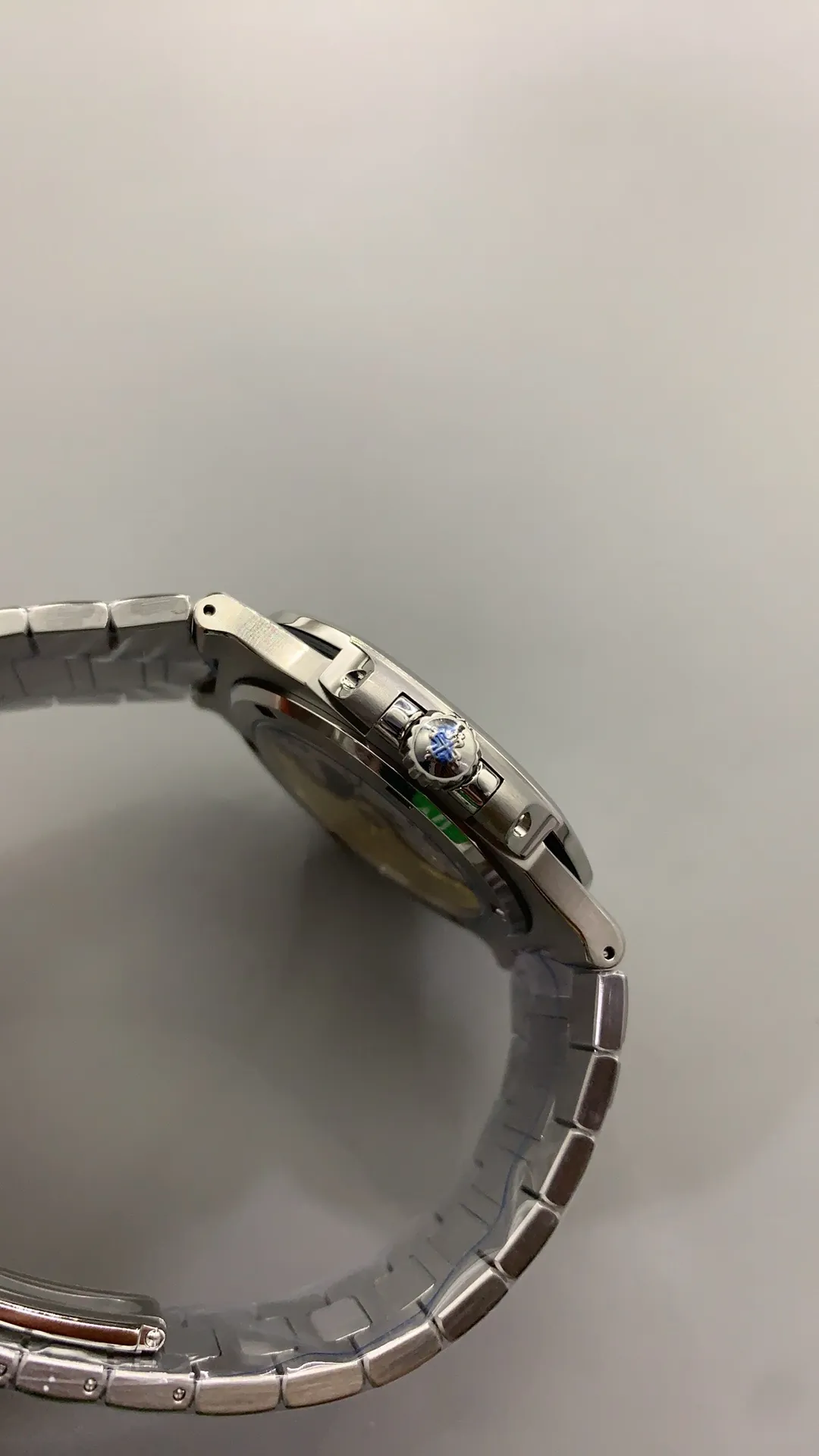
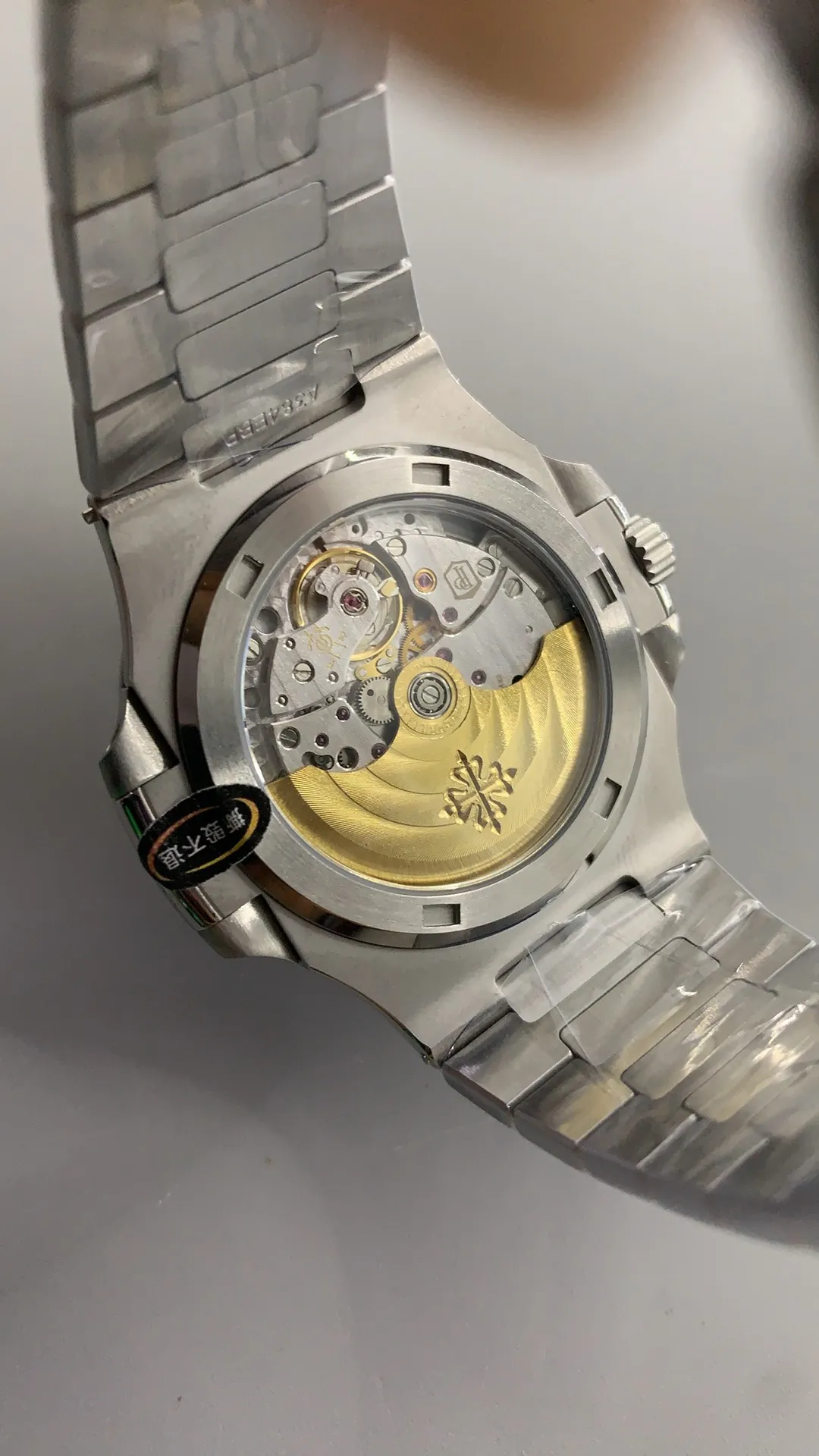
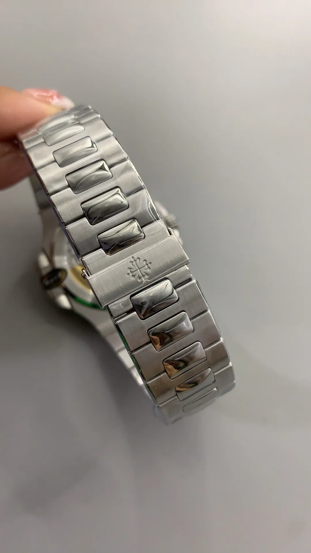
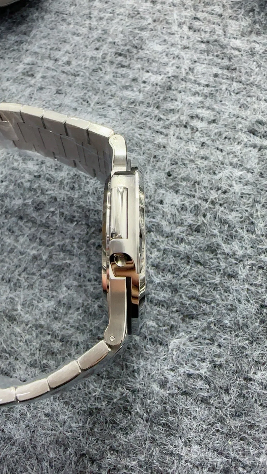
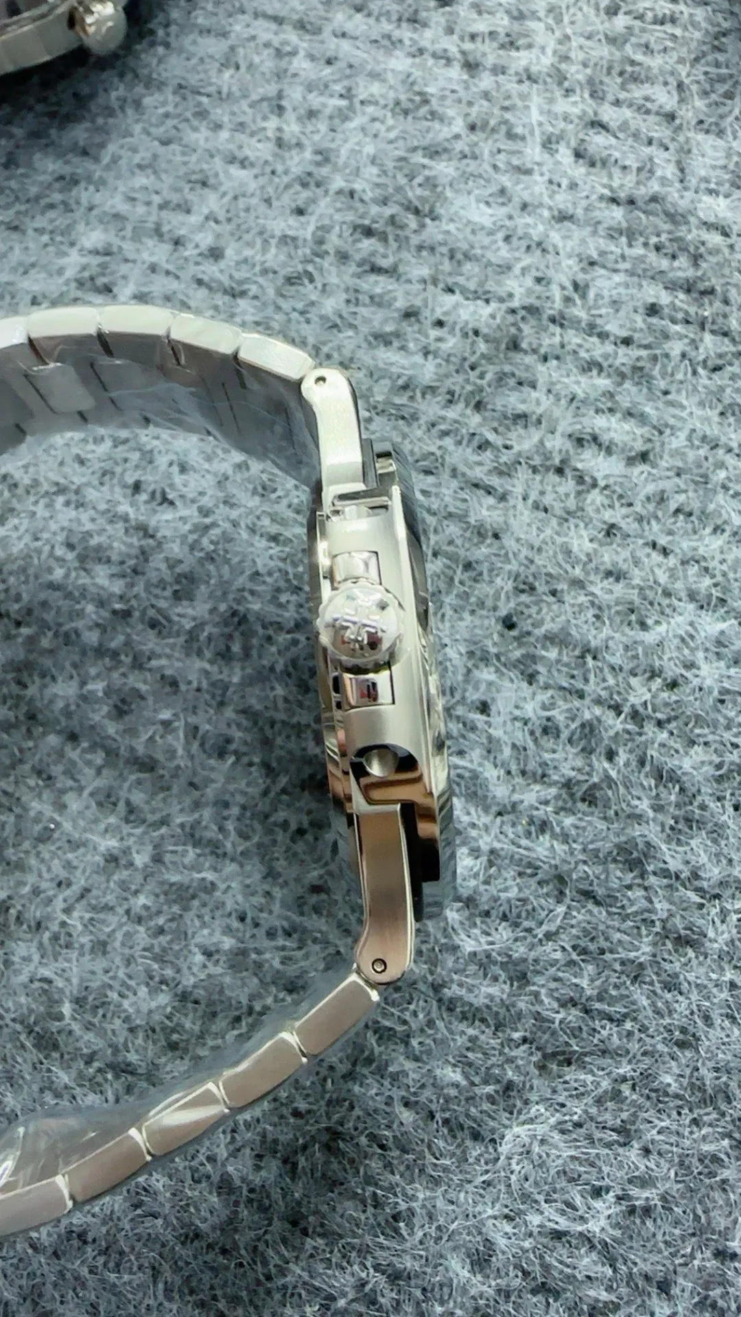
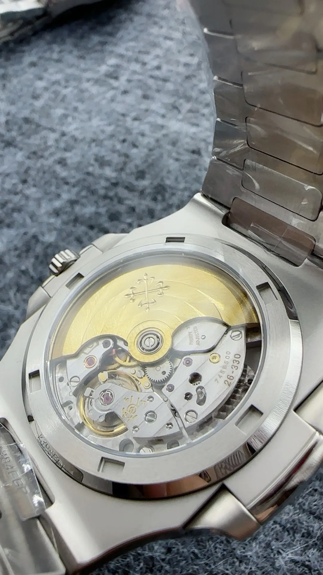
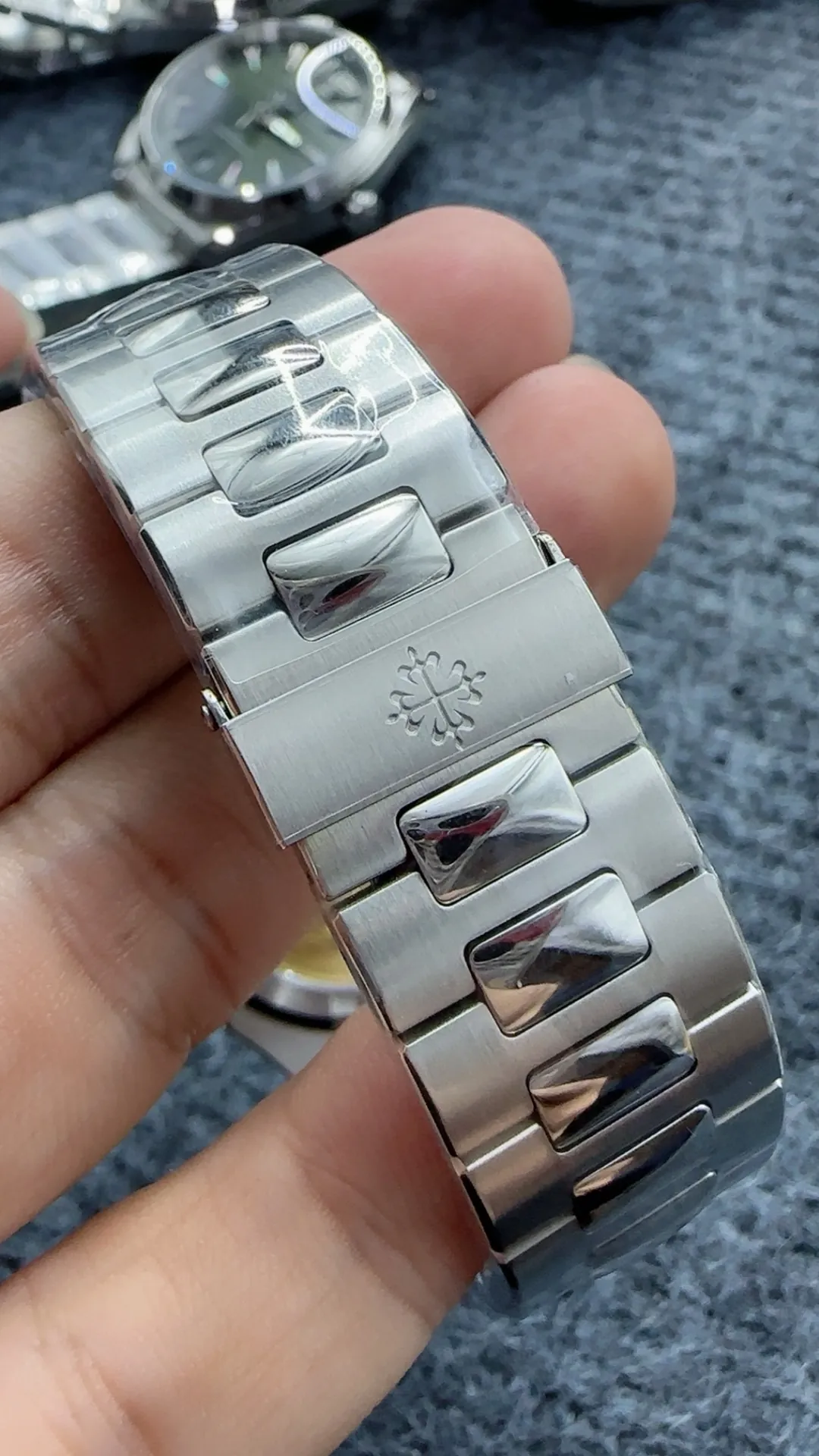
The bracelet is where the 3KF Patek Philippe Nautilus 5711 starts to feel like a complete design rather than simply a watch head attached to a steel band. The Nautilus bracelet relies heavily on the contrast between brushed and polished surfaces. On the 3KF version, the broader sections show a satin-style brushed finish, while the narrower polished areas reflect more light as the wrist moves. The important point is not only whether the correct sections are brushed or polished, but also how cleanly those finishes meet. Sharp transitions make the bracelet appear more carefully finished, while uneven borders would quickly reduce the effect. In ordinary lighting, the different surfaces create enough contrast to give the bracelet depth without making it look overly shiny. This balance works especially well with the polished bezel and helps maintain the sporty but refined appearance of the 5711.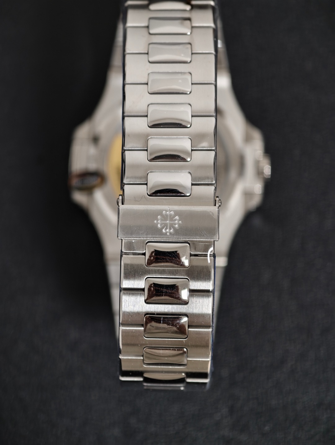
Link Movement and Wrist Comfort
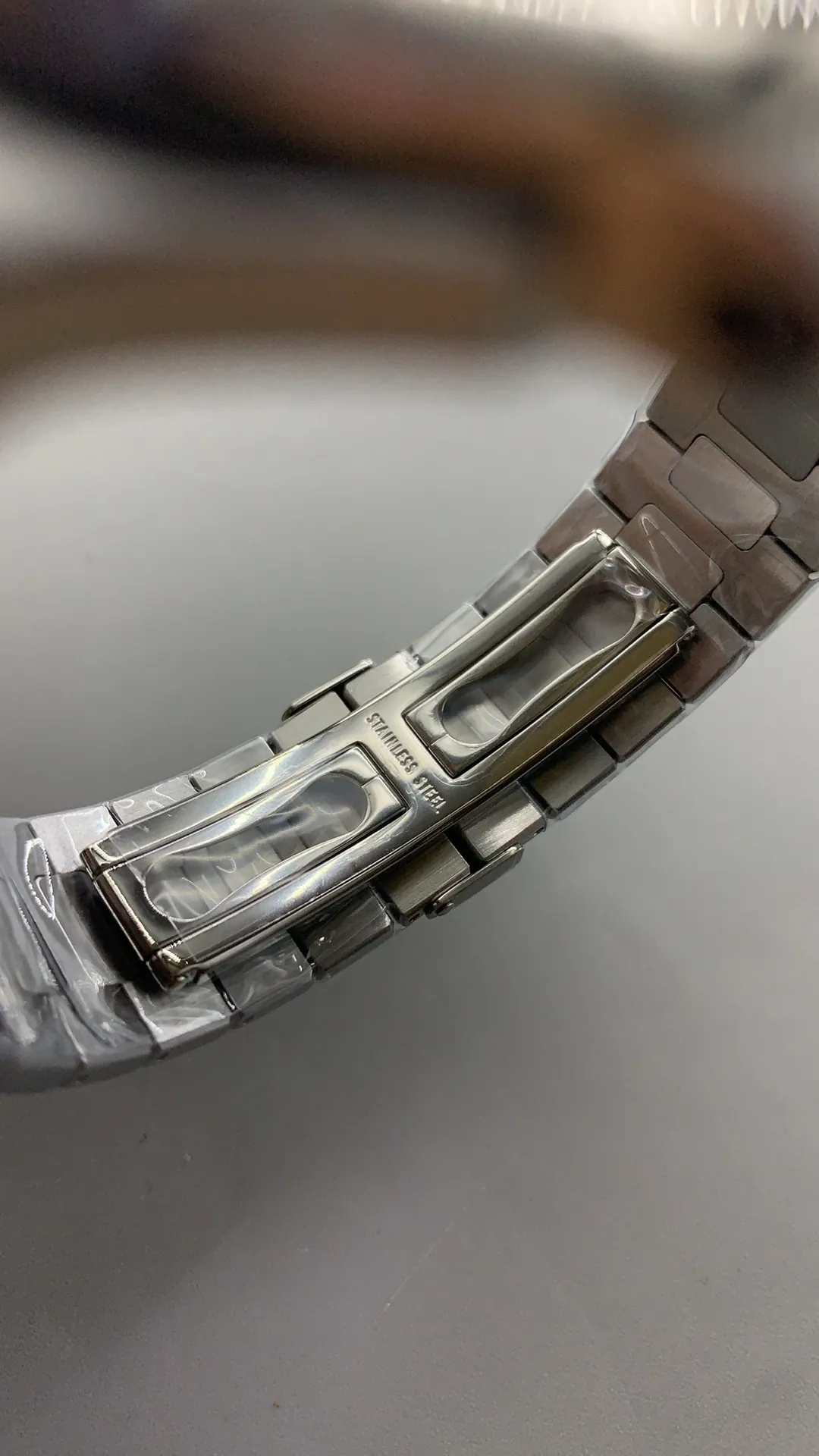
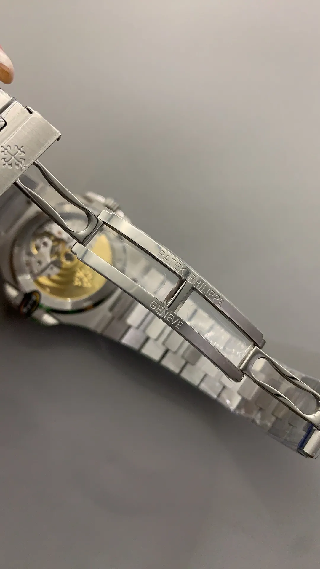
A Nautilus bracelet needs to look good, but it also needs to move naturally around the wrist. The individual links on this version articulate smoothly enough to follow the curve of the arm without creating a stiff or rigid feeling. This is important because the integrated bracelet is visually connected to the case, so an awkward transition would be noticeable both on and off the wrist. The gradual taper also helps the watch feel more balanced, particularly because the Nautilus case has a broad, flat shape. When the bracelet bends, the gaps between the links remain relatively controlled, which keeps the overall appearance tidy. Comfort depends on more than weight alone. Smooth link edges, good articulation, and a clasp that sits flat all contribute to how the watch feels after several hours. In daily wear, these details matter more than they do in photographs.
Dial and Bracelet Work Best Together
What makes the 3KF Patek Philippe Nautilus 5711 interesting is not one isolated detail, but the way the dial and bracelet support each other. The blue horizontal dial provides the visual identity, while the bracelet adds the finishing contrast that makes the case design feel complete. The dial is more likely to attract attention first because its color changes noticeably under different lighting conditions. The bracelet becomes more impressive when viewed from different angles, where the brushed and polished surfaces create alternating reflections. Neither part needs to be excessively bright or decorative. The strength of the 5711 design comes from controlled details, clean proportions, and subtle changes in texture. For anyone examining this version closely, the dial is the obvious starting point, but the bracelet deserves just as much attention because it plays a major role in the overall wearing experience.